What Are The Key Components Of A Landing Page

Nick Czerwinski
PPC & Local SEO Specialist
Landing page design is an essential part of any digital marketing strategy. A landing page on your website is designed to convert visitors into customers by focusing their attention on a specific offer or call-to-action (CTA).
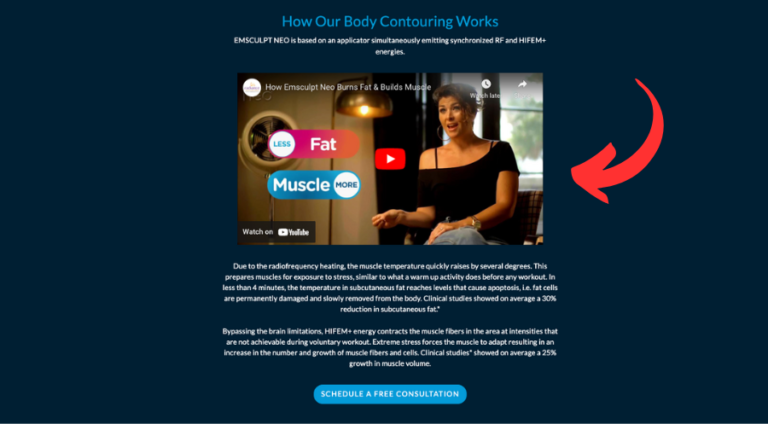
In order to create an effective landing page, you need to understand the key elements that make up a successful landing page. These elements include a clear and concise headline, a strong sub-headline that supports the headline, a prominent and clear call-to-action, a short and simple form, images and videos that showcase the product or service, social proof, benefits, limited navigation, and mobile optimization.
The structure of your landing page can vary depending on the product or service you’re promoting, but it’s essential to keep in mind that the goal of your landing page is to keep visitors focused on your offer and to guide them toward taking action.
Testing and optimization are also essential parts of creating a successful landing page. A/B testing different elements of your landing page can help you identify which elements are most effective at converting visitors into customers.
In this blog, we’ll take a closer look at these elements and provide tips and best practices for creating an effective landing page that converts visitors into customers. Whether you’re a small business owner, a marketer, or a freelancer, this blog will provide the tools you need to create a landing page that drives results.
The Importance of a Clear and Concise Headline on Your Landing Page
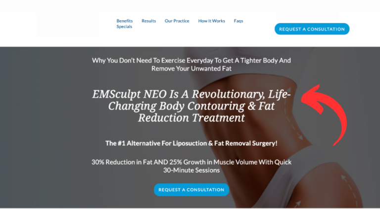
Your headline is the first thing visitors will see when they land on your page. It should be clear, concise, and grab the visitor’s attention. Your headline should clearly state the benefit of your product or service and give visitors a reason to stay on your page.
Designing a Prominent and Clear Call-to-Action (CTA) for Better Conversion
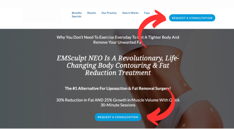
Your call to action is the most important element on your landing page. It should be prominent, clear and tell visitors what action you want them to take. Your CTA should be placed above the fold so visitors can see it without scrolling. Use action-oriented language in your CTA, such as “Download Now,” “Get Started,” or “Sign Up Today.”
Implementing a Clickable and Trackable Phone Number on Your Landing Page

Having a clickable and trackable phone number on your landing page is essential for providing a seamless and effective user experience and for Google Ads call tracking. By making it easy for potential customers to reach out to you, you increase the chances of converting them into paying customers.
A clickable phone number allows users to simply tap on the number displayed on the landing page from their mobile device, which automatically initiates a call to your business. This eliminates the need for users to manually dial your phone number, which can be a cumbersome and frustrating experience, particularly for those who are on-the-go or have limited time.
Moreover, by using a trackable phone number, you can gain valuable insights into your marketing efforts, including which campaigns are driving the most phone calls and which are falling short. This data can help you refine your marketing strategy, optimize your landing page, and ultimately, improve your overall conversion rate.
Utilizing a Short and Simple Form to Improve User Engagement
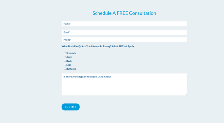
If you’re collecting visitor information, your form should be short, simple, and easy to fill out. Ask for only the information you need to follow up with the visitor. A long and complicated form can be a turn-off for visitors and can decrease conversions.
Showcasing Benefits to Enhance Your Landing Page Effectiveness

List the benefits of your product or service clearly and concisely. Visitors want to know what’s in it for them. Highlight the unique selling points of your product or service and explain how it can solve their problems or meet their needs.
Using Social Proof to Build Trust and Credibility on Your Landing Page
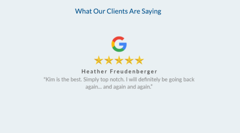
Adding social proof, such as customer testimonials or reviews, can help build trust with your visitors and increase conversions. Use authentic customer testimonials and reviews, and make sure they are prominently displayed on your landing page.
Implementing Limited Navigation for Focused User Experience

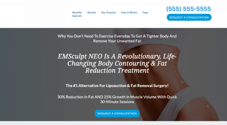
Keep your navigation simple and limited. The goal of your landing page is to keep visitors focused on your offer and to guide them toward taking action. Remove any unnecessary links or distractions that may divert their attention from your CTA.
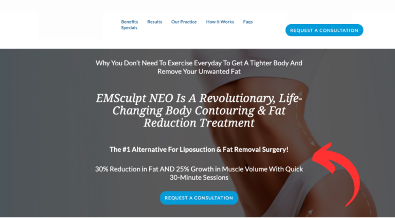
The navigation on this sample page brings users who click on it to different sections of the same page so as not to distract them from the goal of converting by bringing them to separate pages on a website.
Ensuring Mobile Optimization for Better Landing Page Performance
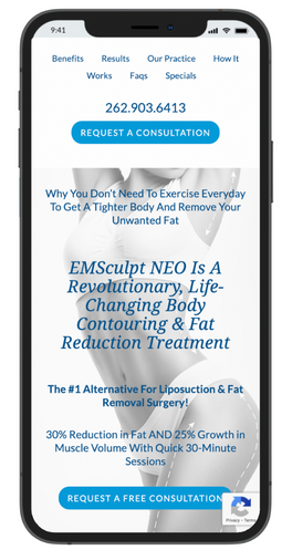
Ensure your landing page is optimized for mobile devices. More and more people are accessing the internet from their phones, so ensuring your landing page looks good on a small screen is essential. Use responsive design and test your landing page on different devices to ensure it’s easy to read and navigate.
By incorporating these key elements into your landing page, you can create a compelling and persuasive page that will help convert visitors into customers. In the next section, we’ll look at the different formats you can use for your landing page and which is best for your business.
Honestly, I consider him part of my Team as well, he really cares about our success. As we grow, he will grow with us. I’m excited about the journey and future with Mike and his Team at Metalogic! If you’re looking at Internet Marketing for your business, simply put he’s the best!

Chris Chustz
Owner, Family First Mortgage
Choosing the Right Landing Page Format for Your Campaign
Understanding Click-Through Landing Pages and Their Benefits

Exploring Lead Generation Landing Pages and Their Strategies
Optimizing Squeeze Pages for Higher Conversion Rates
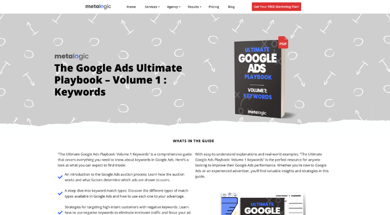
Squeeze pages are similar to lead generation landing pages but typically have a shorter form and stronger call-to-action. The goal of a squeeze page is to get visitors to take immediate action, such as signing up for a free trial or downloading an e-book. Squeeze pages are effective for products or services with a low entry barrier.
Enhancing Conversions with Video Sales Letters on Your Landing Page
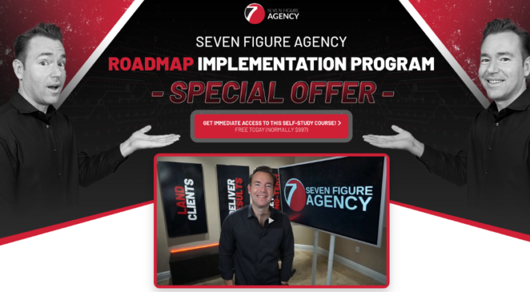
Video sales letters are similar to sales pages but use video instead of text to persuade the visitor to purchase. A video sales letter aims to build trust with the visitor and provide a persuasive argument for why they should make a purchase. Video sales letters are effective for products or services that require more explanation or have a high price point.
When choosing the format for your landing page, consider the product or service you’re promoting, the goal of your landing page, and the preferences of your target audience. Test different formats to see which one works best for your business. In the next section, we’ll look at how to optimize your landing page for conversions.
Designing Effective Sales Pages for Your Products or Services
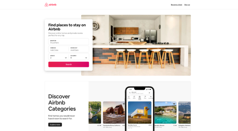
Sales pages are designed to sell a product or service directly to the visitor. The goal of a sales page is to persuade the visitor to make a purchase. Sales pages typically include a detailed description of the product or service, customer testimonials, and a solid call to action. Sales pages are effective for products or services with a high price point.
Custom Marketing Plans Starting at $500 / month
Strategies for Optimizing Your Landing Page for Maximum Conversions
Once you have chosen the correct format for your landing page, the next step is to optimize it for conversions. Here are some tips to help you create a landing page that converts visitors into customers:
Keep it Simple
Your landing page should be simple, easy to navigate, and focused on your offer. Avoid clutter, distractions, or unnecessary information that could divert visitors’ attention from your CTA. Use short and concise sentences, bullet points, and images to break up the text and make it more digestible.
Use a Strong Headline
Your headline is the first thing visitors will see, and it should be firm, clear, and attention-grabbing. Your headline should clearly state your offer’s benefit and give visitors a reason to stay on your page. Use action-oriented language and make sure your headline is relevant to your offer.
Create a Compelling Value Proposition
Your value proposition is a statement that explains why your product or service is unique, valuable, and relevant to your target audience. Your value proposition should be clear, concise, and focused on the benefits of your offer. Use language that resonates with your target audience and highlights the problem your offer solves.
Use High-Quality Images and Videos
Images and videos can be used to showcase your product or service and provide additional information to visitors. Use high-quality photos and videos that are relevant to your offer and convey the benefits of your offer. Avoid using generic or stock images that do not represent your brand or offer.
Include Social Proof
Adding social proof, such as customer testimonials, reviews, or trust badges, can help build trust with your visitors and increase conversions. Use authentic customer testimonials and reviews, and make sure they are prominently displayed on your landing page. Trust badges, such as security seals or money-back guarantees, can also increase visitors’ trust in your brand.
Use a Clear and Compelling Call-to-Action (CTA)
Your call to action is the most important element on your landing page. It should be prominent, clear and tell visitors what action you want them to take. Use action-oriented language in your CTA, such as “Download Now,” “Get Started,” or “Sign Up Today.” Make your CTA visible above the fold, and use contrasting colors to make it stand out.
Test and Optimize
Testing is the key to optimizing your landing page for conversions. A/B testing allows you to test different landing page versions and see which one performs better. Test different headlines, images, CTAs, or forms to see which generate the highest conversions. Use analytics tools to track visitors’ behavior on your landing page and identify areas for improvement.
Methods for Measuring and Analyzing Landing Page Success
Measuring the success of your landing page is crucial to understanding how well it’s performing and identifying areas for improvement. Here are some metrics you should track to measure your landing page success:
Conversion Rate
Conversion rate is the percentage of visitors who take the desired action on your landing page, such as purchasing, filling out a form, or downloading a resource. The higher your conversion rate, the better your landing page is performing.
Bounce Rate
The bounce rate is the percentage of visitors who leave your landing page without taking any action. A high bounce rate indicates that your landing page is not engaging or relevant to your target audience, and you may need to make changes to improve its performance.
Time on Page
Time on page is the amount of time visitors spend on your landing page before leaving. The longer visitors stay on your page, and the more engaged they are with your offer, and the higher the likelihood they will convert.
Click-through Rate (CTR)
Click-through rate is the percentage of visitors who click on a link or button on your landing page, such as your CTA button or a link to your product page. A high CTR indicates that visitors are engaged with your offer and interested in learning more.
Return on Investment (ROI)
Return on investment is the amount of revenue generated by your landing page compared to the cost of creating and promoting it. Calculating your ROI can help you understand the financial impact of your landing page and determine whether it’s worth investing more resources into.
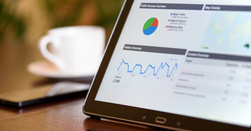
You can use analytics tools such as Google Analytics to track these metrics, which can provide insights into your landing page’s performance and visitor behavior. Once you have gathered data on your landing page’s performance, you can use it to optimize it and improve its conversion rate.
In the next section, we’ll discuss some common mistakes to avoid when creating a landing page, so you can ensure your landing page is performing at its best
Avoiding Common Mistakes When Designing and Implementing Landing Pages
Creating a landing page can be challenging, especially if you’re new to marketing or web design. Here are some common landing page mistakes to avoid:
Lack of Clarity and Relevance
Your landing page should be clear, concise, and relevant to your target audience. Avoid using vague or confusing language, and make sure your offer is easy to understand. Use language that resonates with your target audience and highlights the benefits of your offer.
Too Much Information
Your landing page should focus on your offer and its benefits. Avoid including too much information or irrelevant details that could distract visitors from your offer. Keep your landing page simple and easy to navigate.
Poor Design and Visuals
Your landing page should be visually appealing and well-designed. Use high-quality images and videos relevant to your offer and convey the benefits of your product or service. Use a color scheme and typography that align with your brand and make your landing page easy to read.
Lack of Social Proof
Social proof, such as customer testimonials, reviews, or trust badges, can help build trust with your visitors and increase conversions. Avoid omitting social proof or using fake or generic testimonials that don’t accurately represent your brand.
Weak or Unclear Call-to-Action (CTA)
Your call to action is the most important element on your landing page. It should be prominent, clear and tell visitors what action you want them to take. Avoid using weak or unclear language, and make sure your CTA is visible and contrasts with the rest of your landing page.
Not Optimizing for Mobile Devices
More and more users are accessing the web on their mobile devices, so optimizing your landing page for mobile devices is crucial. Avoid using too small fonts or images that take too long to load. Ensure your landing page is responsive and easy to navigate on different devices.
Not Testing and Optimizing
Testing and optimization are key to improving the performance of your landing page. To see what works best, avoid launching your landing page without testing different elements, such as headlines, images, and CTAs. Use analytics tools to track your landing page’s performance and identify areas for improvement.
By avoiding these typical landing page mistakes, you can create a landing page optimized for conversions and helps you achieve your business goals.
Conclusion
Creating a landing page is a critical step in your digital marketing strategy. A well-designed landing page can help you convert visitors into customers, boost sales, and achieve your business goals. To create an effective landing page, you should define your offer, use persuasive copywriting and visuals, optimize your page for conversions, and measure your success.
Remember to keep your landing page clear, relevant, and focused on your offer. Avoid common mistakes such as using too much information, poor design, weak CTAs, and not optimizing for mobile devices. Use analytics tools to track your landing page’s performance and identify areas for improvement. By continually testing and optimizing your landing page, you can ensure it performs at its best and delivers the desired results.
We hope this guide has provided valuable insights into creating an effective landing page. Remember to keep your audience in mind, and be bold and experiment with different approaches until you find what works best for you. With the right strategy, a well-designed landing page can be a powerful tool for growing your business and achieving your marketing goals.
Become A Google Ads Specialist With MetaLOGIC's Local Digital Marketing Academy
Get your business in front of the right people with Google Ads. From display and search campaigns to Shopping and video campaigns, there’s a way to reach your target audience on the Google Ads platform. Don’t wait to see results – Learn more about our Google Ads Online Training Course.

